Shiakh Soeb
UI/UX Designer
Design a mobile app for a hair salon to help busy people.
This is a conceptual app that allows users to view and book appointments at nearby locations.

Overview
It's no secret that the exhausting long queues and delays at the salons have annoyed us all. Beauty Bounty is a conceptual app that allows users to view and book appointments at nearby locations.
Role
UX Researcher, UX Designer, UI Designer
(Designing an app for Beauty Bounty salon app from conception to delivery.)
My Contribution
Conduct Interviews, User Personas, Journey Maps, User Flow, Wireframes, Prototypes, Usability Studies, and UI Designs.
Timeline
June 2022 (3 weeks)

User Research
Understand the end-to-end process of how participants are currently making booking appointments.
Methodology
To get better insights, I decided to collect data in the form of online surveys to include more users in the research process. Survey questions were divided into two sections: quantitative and qualitative.
Demographics
A total of 30–40 individuals participated in the study, and the target audience was participants aged between 18–45 years old. Like working professionals, students, homemakers with small kids, etc.

User Personas
According to the results of my survey, there were various types of users with different requirements. The insights and common patterns that came from the user’s responses allowed me to create personas, which are the characters who represent that data.


Journey map
I also created journey maps for the above two personas' traditional booking processes. This exercise helped me understand users' mental states through various stages of the overall process.


Problem statement
The user's goal is to find a trained salon service provider and avail the service at their convenience.
Pain points
These are common topics that have come up in meaningful insights. Hence, I think these points are important.
Nearby Location
Customers can’t find or may not be aware of the location of nearby salons.
Types of Services
The services each salon provides may be different. There is no way to know them.
Price of service
The pricing of each service may vary according to the salon. The customer cannot find or know them before reaching the salon.
Wastage of time
The customer has to wait in a long queue for their turn, which may lead to wastage of time.
User Flow
To outline all the necessary functionality, I created user action flow diagrams.
The following flow chart shows the 'Primary tasks' throughout the app.


Usability study
To test the ease of navigation by observing how users move through the app while the following task prompts.
Methodology
Usability tests were done via Google Meet. I wrote a script and a protocol for the testing process and asked the user to perform certain tasks, identify clickable parts of the prototype, and give observation and feedback.
Demographics
A total of five participants are between the ages of 18 - 45 and make monthly visits. Two males, three females, and one participant with a visual impairment.
Round 1 findings
Explore App
Based on the theme that: for most users, exploring nearby places are useful but not an overwhelming majority, An insight is that users need to explore the salon and stylist without logging in.


Change location
Based on the theme that the change location is difficult to find for almost all users, An insight is that users need a more intuitive way to update the location.
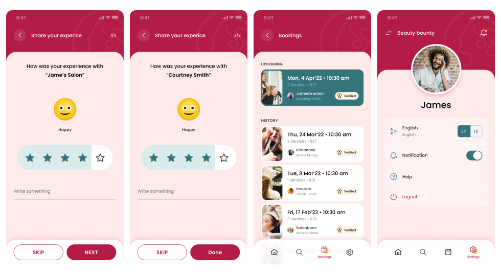
Rate Experience
Based on the theme that most users were unsure how to rate the service, an insight is that users need better placement for rating services to review salons or stylists.

Style Guide
After implementing the feedback points received from usability testing, I started working on the visual side of the Beauty Bounty salon app. I set a style guide to improve communication by ensuring consistency within a screen and across multiple screens of the app.

Round 2 findings
Time Selection
Early designs allowed for some customization.
But after the usability studies, I added additional options to choose a specific group time slot. I also revised the step design so users can easily find out the completed steps.


Payment Options
The second usability study revealed frustration with the payment flow. To streamline this flow, I added more payment options to this screen.
Mockups
In the final design, I included spacing and consistency in fonts and shadowing, as well as making icons and aligning text. As a result, my stakeholders are happy with the overall visuals of the app.


Takeaways
Here are Two of my key takeaways
Research is a must
I couldn’t have designed product users loved without the help of the people who would actually use it. The user survey revealed unexpected information and made it possible to adapt the product to users’ needs.
Solution must be user driven
Conducting user testing and evaluating users' feedback at various stages helped me to discover and eliminate pain points at early stages.
Thanks for taking the time to read my case study!
If you have any feedback or would like to get in touch, please feel free to contact me.